Anglo American
Superunion
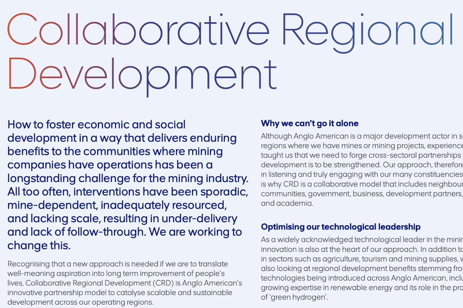
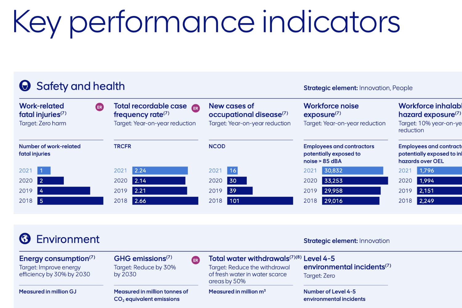
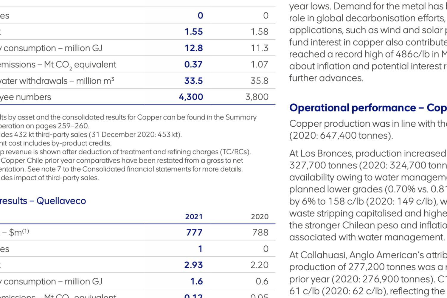
Superunion approached us to design a new type system for the AngloAmerican rebranding process. We developed two sets of fonts, one for headlines and logo and another set for text settings. Geometry and consistency were the keywords, making sure we could achieve symmetry with subtleties in a well-balanced typeface, achieving a smooth flow throughout the letterforms where possible.
Anglo American - Overview
Anglo American
In Use


Fonts
AA Smart Sans
Styles
Thin, Thin Italic, Light, Light Italic, Regular, Regular Italic, SemiBold, SemiBold Italic, Bold & Bold Italic
Script
Latin Extended
Art Direction
Superunion
Client
Anglo American Plc